In early 2019 I was asked to help out Ordo with the user experience of their newly developed payment system. I’ve learned that in the UK a new system called the Open Banking API will be launched for all major banks this summer. It’s a new and simpler way to pay that allows building all kind of functionality on top of it.
Ordo Pay is designed for small business owners, think about boiler engineers, cleaners or gardeners. It’s a niche that has a lot of problems and zero solutions to digitalise and manage their business. On the other side, we have their clients who are moving away from independent sole traders, for the same reasons: lack of a default way of communication, a multitude of channels (I will explain this a bit later) and support.
Time
3 months
My Role
Research
Product Design
UX Design
Team:
Product Designer (me)
Assistant brand designer
User Researcher
Tools:
Sketch
Flinto
Google Spreadsheets
Miro board
How does it work?
Ordo Pay gives you the options to register as a sole trader (limited company or other similar legal entity) or as a household user.
As a business owner it allows you to send payment requests to a household user you are working with. When the household user receives the payment request, he has the main option to pay or a couple of more options like extend the deadline or payment in instalments. Once the request it’s paid, the system automatically detects it and notifies on both sides as paid, so a lot hassle is spared like constantly checking the bank account, messages and missed calls.
This will make Ordo Pay the one-stop place in case of a household user to pay for cleaners, electricians, mechanics etc. As for the business owners, it will act as their management tool for business.
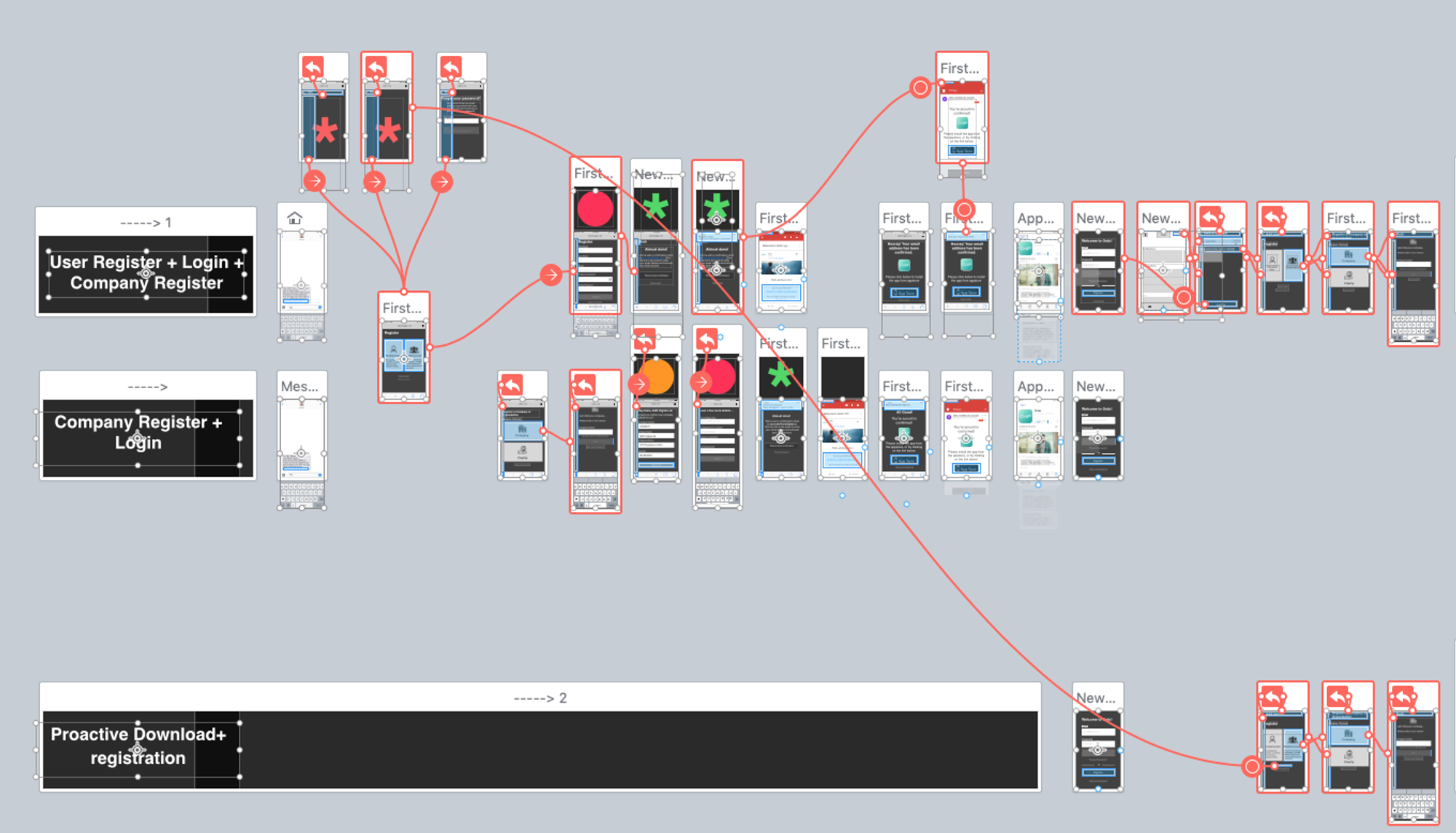
As a start
I had to familiarise with the business and walk though existing user journeys. As it had a lot of complexity around the tech Side of things, a priority was to treat the flow in such a way it would pass the strict banking regulations.
In development they had a development version of the app that was available to beam in TestFlight and started a heuristic overview evaluation of it. Lots of functionality was there but it was created for debugging the iOS and backend environment.


Research
Things we liked:
Open magic email link — Slack
Household tasks — Taskrabbit
Bidding for an item — Ebay
Arrivals and departure flights to an airport — Flightradar
User registration flow


Prototyping
As we where constrained by time, after we nailed down the user flows we jumped straight into prototyping. Lots of screens where designed directly into Flinto, a Sketch like software that allows to rapid prototype apps with a complex set of interactions like swipe back, scroll and variables.
Testing
in order to learn more about how small business owners are relating with customers, the team recruited around 7 small business owners and 8 household users to test the app.
It was interesting in testing to learn how hard is to manage a business, as most of the small business owners are mobile users and they don’t pay for a proprietary software or use google docs suite.

Results
In testing I encouraged every member of the team to write down their observation and ideas on post it notes and sticked them up on a whiteboard grouped by stages.
We then used Miro Realtimeboard to track them, count duplicates and write them in a text form spreadsheet. After that we discussed how we prioritise them with the tech team.


Iteration
After the testing we decided along with the CTO to prioritise the issues that we encountered. With all these I started the process of solving the design.

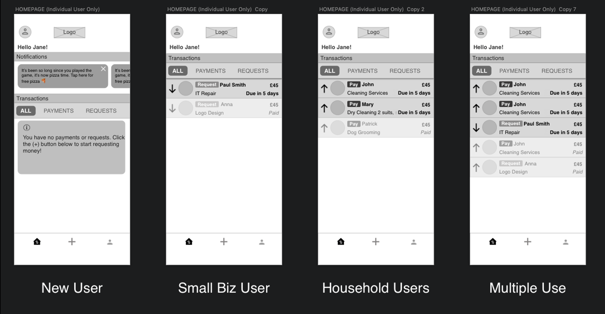
Dashboard
One interesting feature was to create a tailored dashboard that works for both household and small business as long to a possible niche of multiple use users.
In the app we've designed a series of interactions modes like Notifications, Confirmations and Info Bubbles. Even though they are similar, they each have different attributes:
Notifications will be visible on top of the dashboard and they will require an action, in fact they act like buttons. Confirmations are just text only, and they will not trigger any action. Info bubbles are part of the learning curve, they are designed to fill areas that are blank or first time to use, often we can use cool imagery and copy.
Tab Navigation
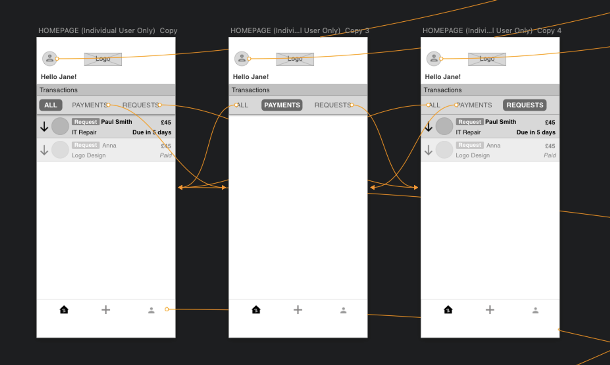
There are two tabs on the bottom nav, the Homepage and the profile. While the (+) plus it is on the nav, it acts more like a button rather than a tab. Once clicked it will prompt a request takeover screen that will cover the menu.
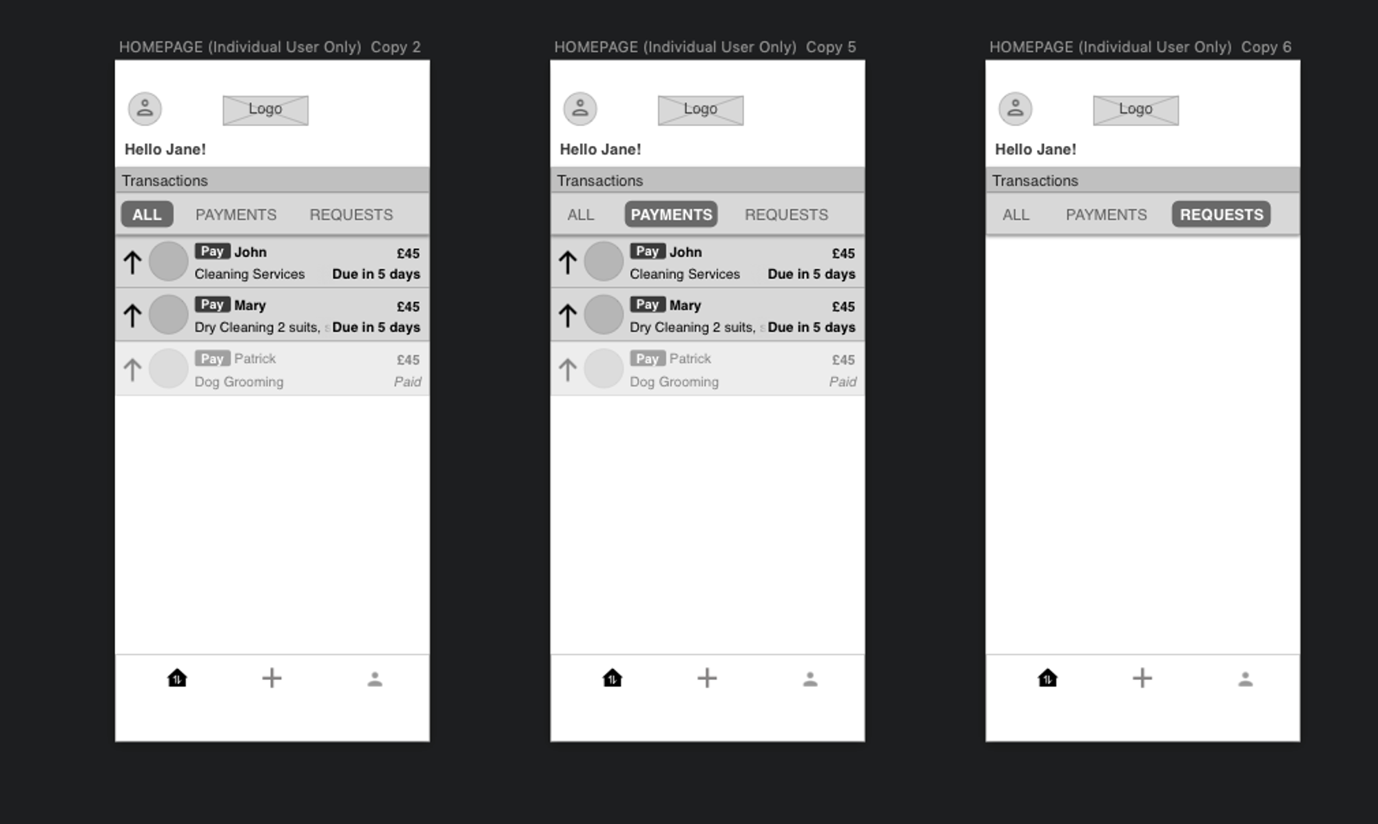
Now the two main journeys are really split up, we had people that would receive request and send them themselves, so when they will see ALL transactions on the homepage they will either see their paying requests (for Household users) or they will see their payment requests (for Small Business users)
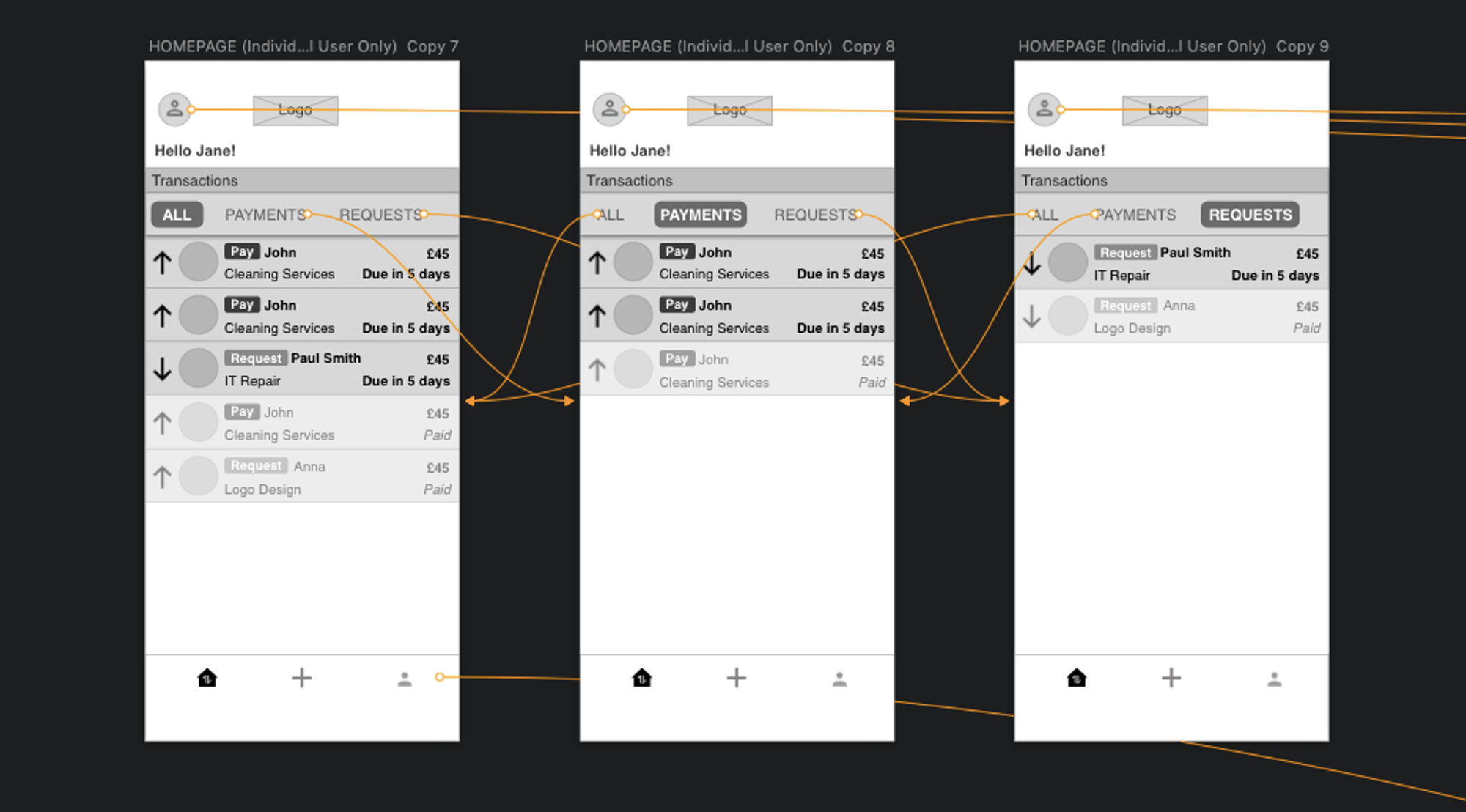
Request Button
The whole point of the app is to push users to make requests, without requests sent and received the whole service is obsolete and risks to get lost within apps on your phone. The success of the service depends on having a big chunky (+) Plus button that will be easily seen and access all the time.
On the first run — The user will be asked to grant access to the contact book
Recurring — Easily access the request for further usage, the aim would be for users to keep it in the same folder on their phone as their everyday banking app
The plus button will launch the payment request journey, once tapped the next step is to select your contact, add a new contact, see the remaining requests.
_Copy_19/w=3840,quality=80,fit=scale-down)
Send Request
I will break down in steps what you need to do in the case you want to send a request. Started with the first thing that comes to mind when you are sending a request that is the person that you are sending it.
Step 1 — Who?
- Recent people
- Address book
- add new contact
Step 2 — How much?
- Amount
- Note or message (Optional)
- Allow part payments
Step 3 — When?
- Due date
- Hot selection cue points
- Allow extension switch
Step 4 — Confirmation + Optional fields
- My reference
- Biller reference
- Attachments

If we don't have access to the contact list and we intend to always enter the details manually we can start with an input field to add the telephone or email or your recipient.

Profile
The profile page is an aggregated view of settings and should contain heuristic links to the most important settings.
Profile Section 1 - Identity
Profile Section 2 - Request Credit
Profile Section 3 - Funding Sources (My Accounts)

FUNCTIONS
Make a request
Here are the user journeys when you are dealing with making requests where we have out main scenario and a couple of edge cases like when you need to add a new contact, when you don't have any requests left and when you haven't been granted access to address book.
User Journey Wireframes

Explanation
Make a Request — In the first journey we have a journey of Jane making a request to Marleah of £670 for her Macbook repair services.
Add new contact — Second journey shows how to add a contact and send a request, we have input fields for Name and Surname, a tab option for email or phone number and an option to add this as a contact in the address book.
No requests left — Third journey is when you don't have enough request left.
No access to address book — Fourth screen represents when you did not grant access to the address book and shows an empty contact list with an info bubble to explain how to give access manually.
Prototype
View a request you've previously made and see options
You have made already made a request, here are the options that you have.
User Journey Wireframes

Explanation
Jane sent a request to Adam on 20 March 2019 for £1000. In the first journey Jane opens the request and see her options, in this case the option to change the date or withdraw the request.
In the second journey Jane choses to Withdraw the request, once she taps 'Withdraw Request' a pop up confirmation would appear in order to confirm the action. Once he confirms, the screen will jumps to the homescreen and the card will change showing 'withdrawn' message in the due box.
In the third story we have the option to Change Due date. Once the 'Change Due Date' CTA is tapped a new screen similar to the one from making a request will appear with an option to edit only the date field. Once you confirm the change you will be directed to the homepage and you will see a confirmation of your change. The due date on the card will be updated but the rest will remain the same.
Prototype
Payments
Here is an example of the payment flow, in the first route we will show how a full payment works and in the second how to part-pay a request.
User Journey Wireframes

Explanation
John had previously sent a request to Jane for the office cleaning services he provided of £670 with the option to part pay on.
In example A, Jane fully pays him and on option B, she part pays him £500 and later the rest of £170. In the prototype the user can always check the history of the transactions in a timeline.

Prototype
Send an Extension Request & respond
In these screens it show how an user sends an payment extend request to another user. The user has an option to agree with the request or decline it.
User Journey Wireframes

Explanation
Route 1 — Jane send's John a request for extenstion
Route 2A — John approves the request
Route 2B — John declines the request
Prototype

Decline a Request
In this case Jane (the client) will decline a request sent from John (the biller) for an office cleaning request of £670 he did.
Jane's screens are having a thin purple tint while John's screen have a green one. The timings are the following: John sent a request on the 18th of march and the action, in this case the client decline, happens on the next day, on the 19th of march. We can always check the timeframe of events accessing the history screen on each transaction by clicking on the 'See history' button next to the main text field.
User Journey

Design
In design I led the way in a clean minimalistic style. I worked with their brand designer in order to set colors and tones.
The wireframes were already modular components in order to ease up the skinning process.
Conclusions
Thanks to Ordo Pay team, ANDigital and Biglight to make this happen!
Press


.gif?w=780&f=webp)


![H&M Staff & Store Planner [AKQA]](https://assets.super.so/32c38527-42be-42cb-9c30-60e3398bb786/images/a8b4cf53-3106-42d3-b0af-4466d58ff820/ezgif.com-optimize_(1).gif?w=780&f=webp)


.gif?w=780&f=webp)

![Peerpoint V2 (Allen & Overy) [Biglight]](/_next/image?url=https%3A%2F%2Fassets.super.so%2F32c38527-42be-42cb-9c30-60e3398bb786%2Fimages%2Ffc4e7969-da62-4b7b-87e7-945d96a29d97%2FScreenshot_2019-11-13_at_14.28.52.png&w=3840&q=80)


