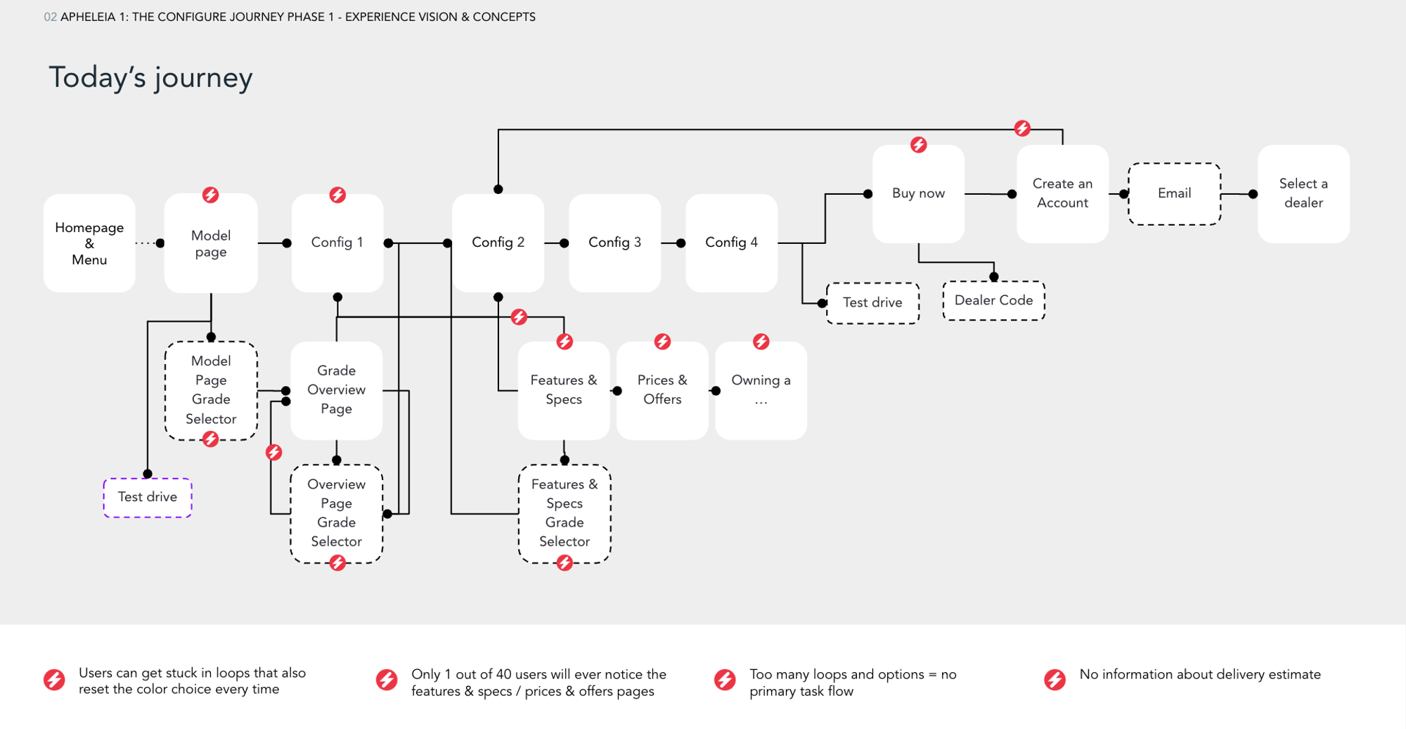
The Problem
Toyota discoevred a weak spot in their ecommerce flow: Too many users stopped on the marketing pages and considered the configurator (that lived as a different experience) too much of a commitment to try it out.
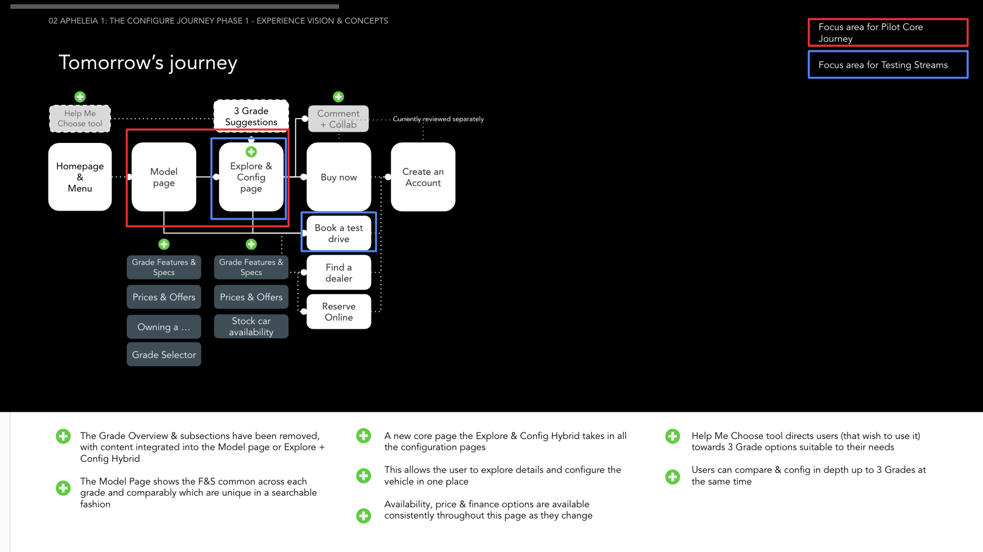
The Solution
A potential solution was to intergrate the configurator within the marketing pages so users can build the potential purchase just by strolling around the website, so users can build a potential car configuration on the fly.
The Expeirence
QR Codes were deemed to be redundant and we had to replace the icon with something that would be more appropriate with the “My configuration” modal for the dealership to know your car config choices.
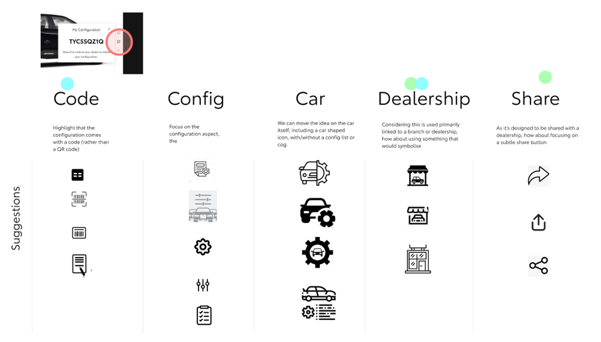
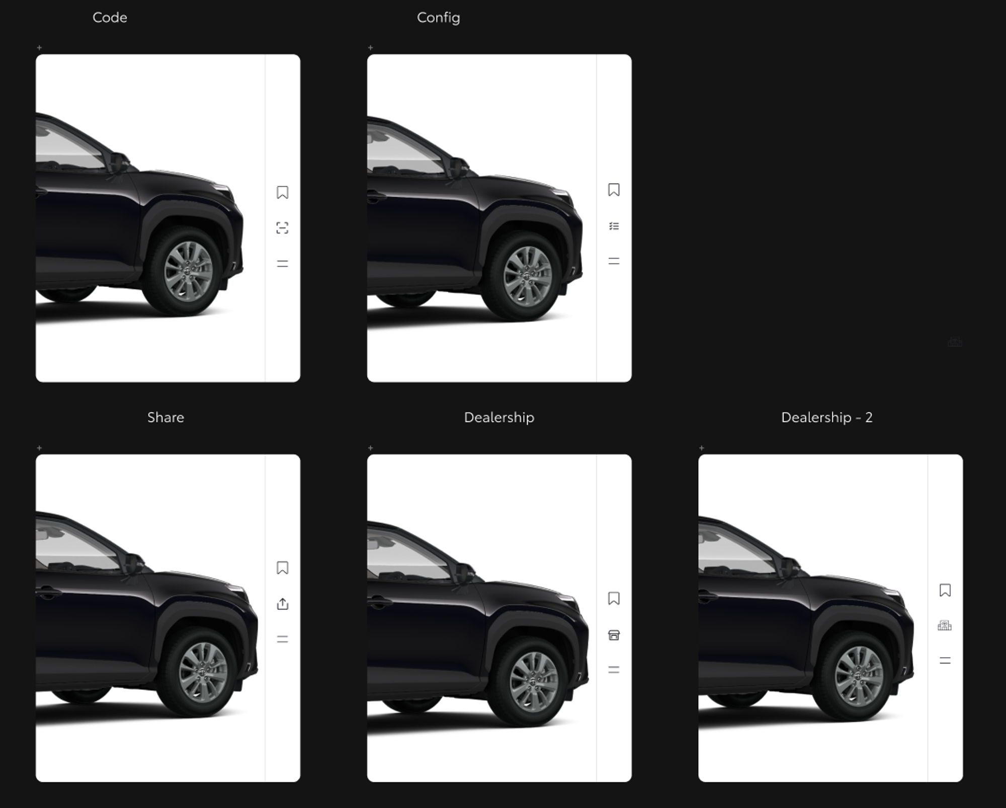
The choices were around replacing the icon with a code as the modal shows, them we explored something around the config, car like icons but also dealership and share.
Share came out of the question quickly as it clashed with future options like to share your configuration to your parstenr. So we took the mental model: How do users will use this icon? In what context? The code is part of the legacy items, it ties with their backend catalog of parts and will be used by the support teams in a call or onsite at the dealershit to quickly determine the options selected by the potential customer. So the dealership icon was one of the most recognizalble, especially if we can introduce a logo of some sort so peoles could easily ask “Tap the dealership icon next to the car, the one with the toyota logo one it!”
The Grade Selector
Whenever you buy a new car, you usually find these side by side comparison of equipment levels for a specific model, usually featuring a fancy name. They act kind of sub brand, indicating the trim level of the car. Usually you can have a selected array of features that are characteristic to the core trim levels.
Use of components is vital to development, design structure and sanity of the designers:) We had a rule of
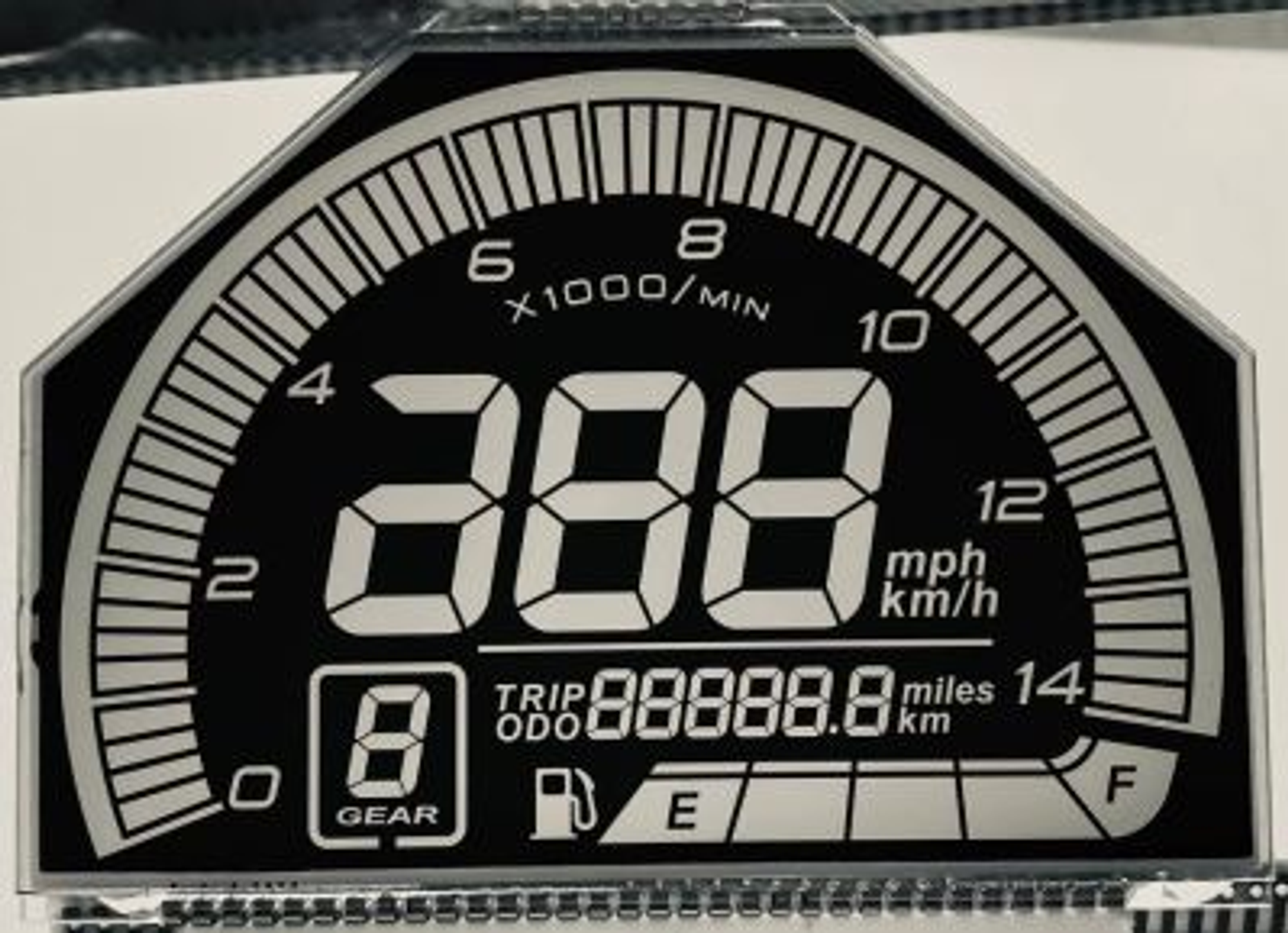
The best example of a card organism are the LCD displays we usually find on wathches, tehrnostats and all kind of appliances. A card should nest a set array of features that can span to many functions.
How far should we go? Even the most incredible component libraries have their limitations, figma with or without using 3rd parties